Reading the Color Wheel: Three Ways that To Make Colors Work Together
I remember being introduced to the color wheel when I was seven years old. At the time it was a simple lesson of how to mix paints when all you had were the three primary colors (yellow, blue, and red). My art teacher told me that the color wheel was something that all art teachers lived by, so much so that they'd be buried with it.
I didn’t believe her, but when I got older and took classes in high school where they went beyond mixing three simple colors, I learned that the color wheel did give me a lot of understanding. When it comes to color there are three palettes that can generate the most interest.

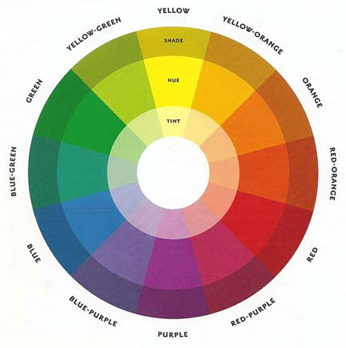
One of the most basic palettes is known as the complimentary palette. The color directly across from the first color on the wheel is its compliment. Suppose you've got an orange couch in one room and you want to bring attention to it, without the colors clashing. You can use a blue tone to gently offset it or one that more closely matches that saturation to balance it out. Similarly, purple and yellow and red and green are also compliments of each other.
Analogous color palettes are another simple cohesive palette. Colors next to each other on the color wheel are analogous to one another. Colors like orange, red-orange, and red for example. Analogous palettes don’t provide a lot of contrast but can add some subtle variety if you want to paint the walls one color and baseboards another color.
Split complimentary palettes are yet another way to create an interesting variety of shades. If you pick a color on the color wheel and look to the two colors next to its compliment you have a split compliment palette. For example, take the color green. Red is green’s compliment and if you want to vary the shades of red you can use red-purple and red orange for some variety.
Of course when talking about color palettes there are factors such as hue, shade, and saturation to bring into account too. It can get overwhelming, but if you have paint chips and samples of your flooring or furniture fabric, viewing it in natural light will help you see if the colors work together. Remember, there are infinitely more colors available at the paint store than there are on a color wheel. Use your judgment and don’t be afraid of picking colors that are a little outside of your comfort zone.
BROWSE HOME PRODUCT ARTICLES
- Creating a Spa-Like Master Bathroom »
- Designing a Water-Efficient Bathroom »
- Design a Modern Bathroom »
- View All Bathroom Articles »
- Building a New Home »
- Building a Duplex »
- Finding the Right Home Builder »
- View All Building Tips Articles »
- Adding the Right Columns»
- Decorative Touches for Your Interior»
- Shutters for Every Architectural Style »
- View All Columns & Millwork Articles »
- How to Use Specialty Laminates »
- Decorative Touches for Your Home's Interior
- View All Countertops and Surfaces Articles »
- What Goes Into a Great Deck? »
- Decorative Touches for Your Home's Interior »
- View All Decking Articles »
- Choosing Glass for Your Entry »
- Stylish Personas for Your Front Door »
- Using Sidelites and Transoms »
- View All Door Articles »
- Choose Siding for Your Region »
- Get the Most Out of Exterior Paint »
- Mixing Siding to Define Your Exterior »
- View All Exterior Articles »
- Finding the Right Home Builder »
- The Appeal of Small House Plans »
- Choosing the Perfect Floor Plan »
- View All Finding a Home Plan Articles »
- Colorful Flooring for Your Home »
- Designing With Different Widths»
- Chic, Neutral, Gray Flooring »
- View All Flooring Articles »
- Garage Doors That Add Curb Appeal »
- Caring for Your Garage Doors »
- Benefits of Insulated Garage Doors »
- View All Garage Door Articles »
- Reclaimed Products for Your Home »
- Building a Green and Stylish Home »
- Benefits of Building with SIPS »
- View All Green Building Articles »
- Cool Gadgets for Your New Home »
- Creating a Hi-Tech Home »
- Efficient Gifts for New Homeowners »
- View All Home Electronics Articles »
- Improve Your Home's Air Circulation »
- How to Improve the Air Circulation in Your Home »
- View All HVAC Articles »
- Bedrooms Designed for Sleep »
- Selecting a Fireplace for Your Home »
- Crafting a Luxurious Master Suite »
- View All Interior Design Articles »
- Design the Perfect Outdoor Space »
- Dive into a Beautiful Pool »
- Design a Sizzling Outdoor Kitchen »
- View All Outdoor Living Articles »
- Apps to Help You Pick Paint Colors »
- Create the Perfect Mood with Paint »
- How to Read the Color Wheel »
- View All Painting & Decorating Articles»
- Creating a Spa-Like Master Bathroom »
- High-Impact Kitchen Upgrades »
- Creating a Water Efficient Bathroom »
- View All Plumbing Fixtures Articles»
- Cladding That Complements Your Exterior »
- Reasons to Consider Prefinished Siding »
- View All Siding & Cladding Articles»
- All About Solar Powered Skylights »
- Natural Lighting for the Dark Corners of Your Home »
- Design a Better Bedroom with Skylights »
- View All Skylight Articles»
.png)
.png)


